Bring Your Spyder Workflow Into Excel If you’re already a Spyder IDE user, you’re used to: With PyXLL and the companion package pyxll-spyder, you can bring that exact same workflow into Microsoft Excel. This means you can continue using the tools and environment you already enjoy, while unlocking the ability to: If you already use
Excel is an incredibly versatile tool, but its built-in charting options are limited when it comes to geospatial data visualization. Thankfully, with Python, you can tap into powerful libraries like Folium to create interactive geospatial plots in Excel. By integrating Python into Excel with PyXLL, you can seamlessly bring these visualizations into your spreadsheets. In
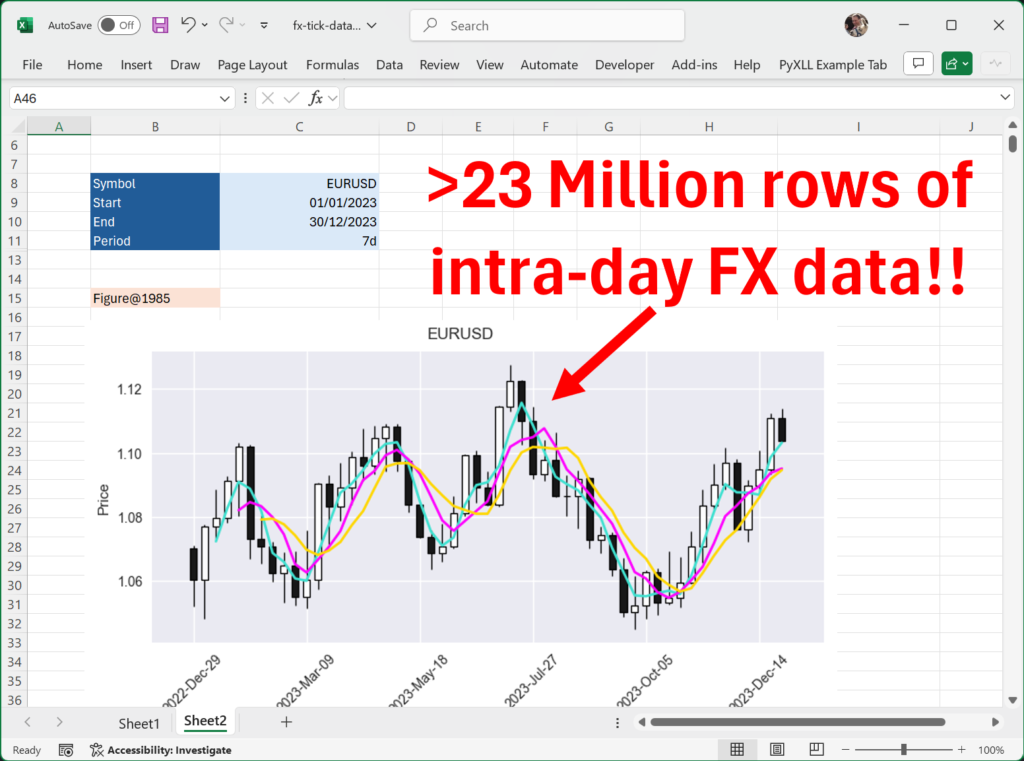
Whether you’re trading for yourself or part of a large trading team, you will more than likely work with huge data sets. Whether you’re developing and refining your own technical indicators or running fully automated algorithmic trading using machine learning, having fast and easy access to accurate data sets is key. Accurate data sets are
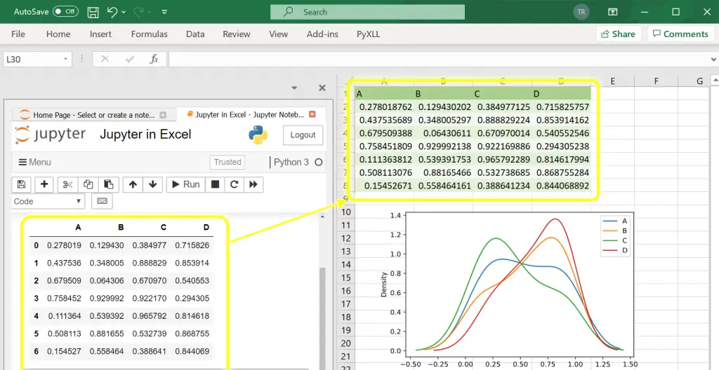
It used to be an “either/or” choice between Excel and Python Jupyter Notebooks. With the introduction of the PyXLL-Jupyter package now you can use both together, side by side.
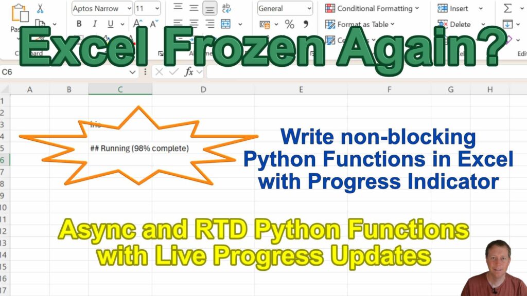
Hit Enter, and your formula runs… but Excel is locked solid. No scrolling. No edits. Just waiting. With PyXLL, it doesn’t have to be that way. You can run long Python functions without freezing Excel — and even show live progress updates while they work. Here’s how. What is a long running function? Ever written
Excel is where many business decisions get made. But when it comes to creating rich, interactive dashboards or data-driven applications, Python tools like Plotly Dash offer flexibility and power that Excel alone can’t match. Plotly Dash is a Python framework for building interactive web apps and dashboards using just Python—no JavaScript required. It’s popular among
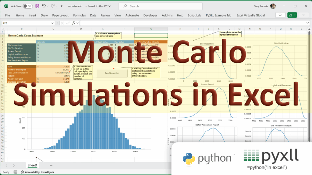
Monte Carlo simulations are essential as an analytical tool in various fields, from finance to project management. Using Python and the PyXLL add-in we’ll explore how to bring the Monte Carlo method to Excel. This Monte Carlo statistical technique allows us to understand and quantify uncertainty by performing repeated random sampling to obtain numerical results.
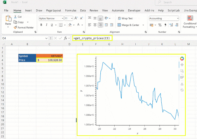
A customer recently asked me how to create a live, updating, real-time chart in Excel using the Python Excel add-in PyXLL. It turns out with the right plotting library it’s much easier than you might think! In this tutorial, we’ll explore how to combine Python’s HoloViz and Panel libraries with PyXLL to create a dynamic
PyXLL 5.9.0 is now available! 🥳 There are some big improvements and new features in this release. I’ve recorded a short video to tell you more… Highlights New html based interactive plotting I’m really excited about the new interactive html based plotting integration.Plotting using plotly, bokeh and altair by rendering static images is still possible,