Excel is where many business decisions get made. But when it comes to creating rich, interactive dashboards or data-driven applications, Python tools like Plotly Dash offer flexibility and power that Excel alone can’t match.
Plotly Dash is a Python framework for building interactive web apps and dashboards using just Python—no JavaScript required. It’s popular among data scientists and analysts for building custom, shareable apps that let users explore data visually in a web browser. But, when it comes down to it, users will always prefer to work in Excel.
That’s where PyXLL comes in.
PyXLL is a Python add-in for Excel that bridges the gap between Python and spreadsheets. And with its support for embedding web apps directly into Excel workbooks, you can now run Plotly Dash apps inside Excel, just like any other part of your spreadsheet.
In this article, you’ll learn:
- What Plotly Dash is and why it’s useful
- How to build a simple Dash app
- How to embed that app into Excel using PyXLL, so your team can use it without ever leaving Excel.
By the end, you’ll have a powerful way to deliver interactive dashboards to Excel users—no web servers, no deployment headaches, just Python and Excel working together.
Table of Contents
Why Embed Dash Apps in Excel?
If you already use Excel, you know its strengths: it’s flexible, familiar, and everywhere. But when it comes to interactive visualizations, advanced analytics, or custom UI components, Excel can fall short. That’s where Plotly Dash shines.
So why not use both?
Embedding a Dash app inside Excel combines the best of both worlds:
- Excel’s accessibility and ubiquity
- Dash’s ability to create rich, interactive Python dashboards
Here are some of the key benefits of integrating the two:
✅ Workflows Stay in Excel
Most business users live in Excel. Embedding your Dash app means you don’t have to ask them to open a browser, run a server, or install Python—they can interact with your app directly in the spreadsheet they already use.
✅ Share Python-Powered Insights
Dash apps let you create custom UI around your Python models and data. With PyXLL, you can deliver those apps in a user-friendly interface without requiring any Python knowledge.
✅ Live, Interactive Visualizations
Unlike static Excel charts, Dash apps can respond in real time to user input. Want to update a chart based on values in a cell? Want a dropdown that filters a dataset or runs a model? Dash makes it easy—PyXLL makes it available in Excel.
Bonus: Use Case Ideas
- Financial modeling with interactive scenario controls
- Real-time dashboards that respond to Excel cell changes
- Custom data exploration tools for business users
- Machine learning models with human-friendly interfaces
Tools You’ll Need to Embed Dash in Excel
Before we dive into building and embedding a Dash app, let’s go over the tools you’ll need. The good news: everything is based on Python and Excel, with no complex deployment setup required.
Here’s what you’ll need:
🧩 1. Python
If you’re reading this, you’re probably already using Python. Any recent version (3.7+) will work. You can install the required packages via pip.
Tip: Use a virtual environment (like
venvorconda) to keep things clean.
📊 2. Plotly Dash
Dash is a Python framework for building interactive web applications. It’s built on top of Plotly.js, React, and Flask—but all of that complexity is abstracted away. You build the UI and the logic in pure Python.
Install it with:
pip install dash
🧬 3. PyXLL
PyXLL is a commercial Excel add-in that lets you write Excel worksheet functions, macros, menus, and ribbon UI in Python. Most importantly for this tutorial, it supports embedding web content (like Dash apps) inside Excel workbooks.
To use it, you’ll need:
- A valid PyXLL installation
- A license (a free trial is available)
Install the Python package via pip:
pip install pyxllAnd then install the PyXLL Excel add-in using the “pyxll install” script:
pyxll installNote: If you’re new to PyXLL, there’s a full getting started guide here.
📈 4. PyXLL-Dash Extension Package
The “pyxll-dash” extension package adds Dash support to PyXLL. Install it using pip:
pip install pyxll-dashStep-by-Step Guide: Embed a Dash App in Excel Using PyXLL
Now that you’ve got the tools installed, let’s walk through how to create a simple Dash app and embed it into Excel. We’ll keep things simple to start—just a basic interactive chart—and then we’ll get it running inside Excel using PyXLL.
from dash import Dash, html, dcc, callback, Output, Input
import plotly.express as px
import pandas as pd

df = pd.read_csv('https://raw.githubusercontent.com/plotly/datasets/master/gapminder_unfiltered.csv')

app = Dash()

# Requires Dash 2.17.0 or later
app.layout = [
    html.H1(children='Title of Dash App', style={'textAlign':'center'}),
    dcc.Dropdown(df.country.unique(), 'Canada', id='dropdown-selection'),
    dcc.Graph(id='graph-content')
]

@app.callback(
    Output('graph-content', 'figure'),
    Input('dropdown-selection', 'value')
)
def update_graph(value):
    dff = df[df.country==value]
    return px.line(dff, x='year', y='pop')

if __name__ == '__main__':
    app.run(debug=True)
🔧 Step 1: Create a Simple Dash App
Start by creating a basic Dash app. Save this in a Python file, for example dash_demo_app.py:
You can run this app like any standard Dash app:
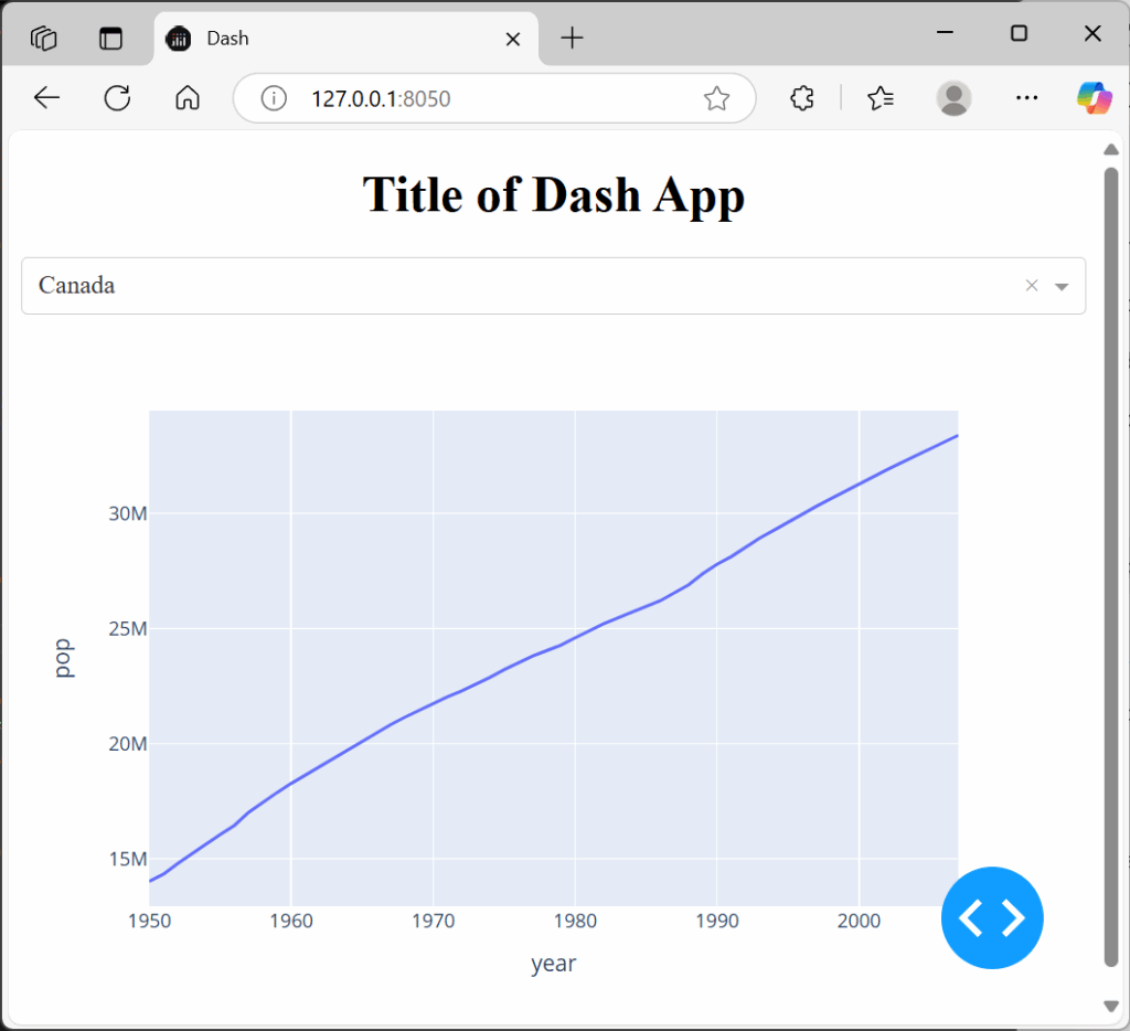
python dash_demo_app.pyIt should launch in your browser at http://127.0.0.1:8050/. This is what we’ll embed into Excel.

🧩 Step 2: Embed the Dash App in Excel with PyXLL
With PyXLL and the “pyxll-dash” package, embedding a dash app is as simple as calling an Excel worksheet function.
In our dash_demo_app.py Python module we do the following:
- Refactor the code into a function called “dash_app”
- Add the “pyxll.xl_func” decorator to the dash_app function
- Call “pyxll.plot(app)” to show the app in Excel.
from pyxll import xl_func, plot
from dash import Dash, html, dcc, callback, Output, Input
import plotly.express as px
import pandas as pd


@xl_func
def dash_app():

    df = pd.read_csv('https://raw.githubusercontent.com/plotly/datasets/master/gapminder_unfiltered.csv')

    app = Dash()

    app.layout = [
        html.H1(children='Title of Dash App', style={'textAlign':'center'}),
        dcc.Dropdown(df.country.unique(), 'Canada', id='dropdown-selection'),
        dcc.Graph(id='graph-content')
    ]

    @app.callback(
        Output('graph-content', 'figure'),
        Input('dropdown-selection', 'value')
    )
    def update_graph(value):
        dff = df[df.country==value]
        return px.line(dff, x='year', y='pop')

    # Show the dash app in Excel using PyXLL's plot function.
    # This requires the "pyxll-dash" package to be installed.
    plot(app)

    return app
To tell PyXLL to load this module, update your pyxll.cfg config file and add your “dash_demo_app” module to the “modules” list, and update the “pythonpath” to include the folder where you saved it.
Now go into Excel, type the following into a cell or use the function from the function wizard:
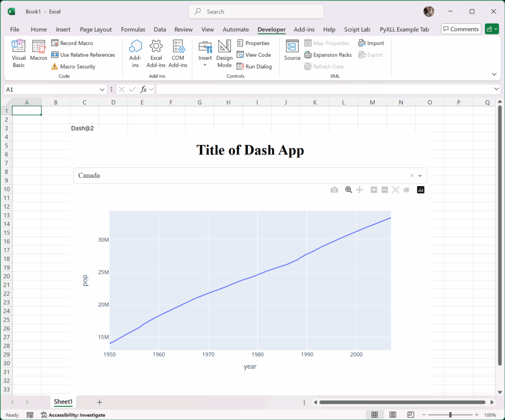
=dash_app()This opens a embedded browser window directly inside Excel, showing your live Dash app.

✅ What You Should See
Once everything is in place:
- Excel displays a live, interactive Plotly Dash app inside a worksheet.
- Users can interact with charts and controls like they would on a web dashboard.
- The app updates in real time, just as if it were hosted in a browser.
Tip: To move or resize the web control, enter “Design Mode” in the “Developer” tab in Excel. Once you’ve finished, exit out of Design Mode to bring back the fully responsive, interactive, control.
Step 3: Passing Data From Excel to Dash
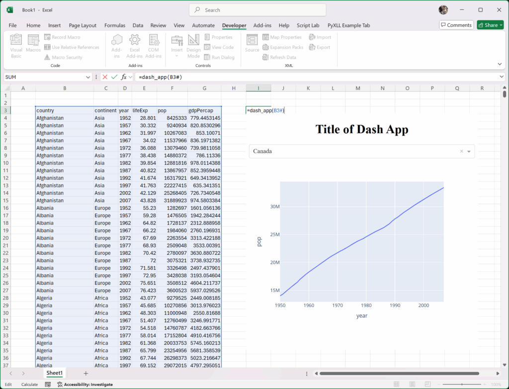
In our “dash_app” we’re loading a CSV file from github. More commonly we will want to populate our dash apps using data from Excel.
To do that we pass in a DataFrame of value as an argument to our function, so our “dash_app” function becomes:
@xl_func
def dash_app(df: pd.DataFrame):
    app = Dash()

    app.layout = [
        html.H1(children='Title of Dash App', style={'textAlign':'center'}),
        dcc.Dropdown(df.country.unique(), 'Canada', id='dropdown-selection'),
        dcc.Graph(id='graph-content')
    ]

    @app.callback(
        Output('graph-content', 'figure'),
        Input('dropdown-selection', 'value')
    )
    def update_graph(value):
        dff = df[df.country==value]
        return px.line(dff, x='year', y='pop')

    # Show the dash app in Excel using PyXLL's plot function.
    # This requires the "pyxll-dash" package to be installed.
    plot(app)

    return app
Let’s also add a new function to load the same data, so we can test this out:
@xl_func
def load_data() -> pd.DataFrame:
    df = pd.read_csv('https://raw.githubusercontent.com/plotly/datasets/master/gapminder_unfiltered.csv')
    return df
Note that in both of the functions above I am using Python type annotations to tell PyXLL what types to use when converting the Excel values.

Step 4: Passing Data From Dash to Excel
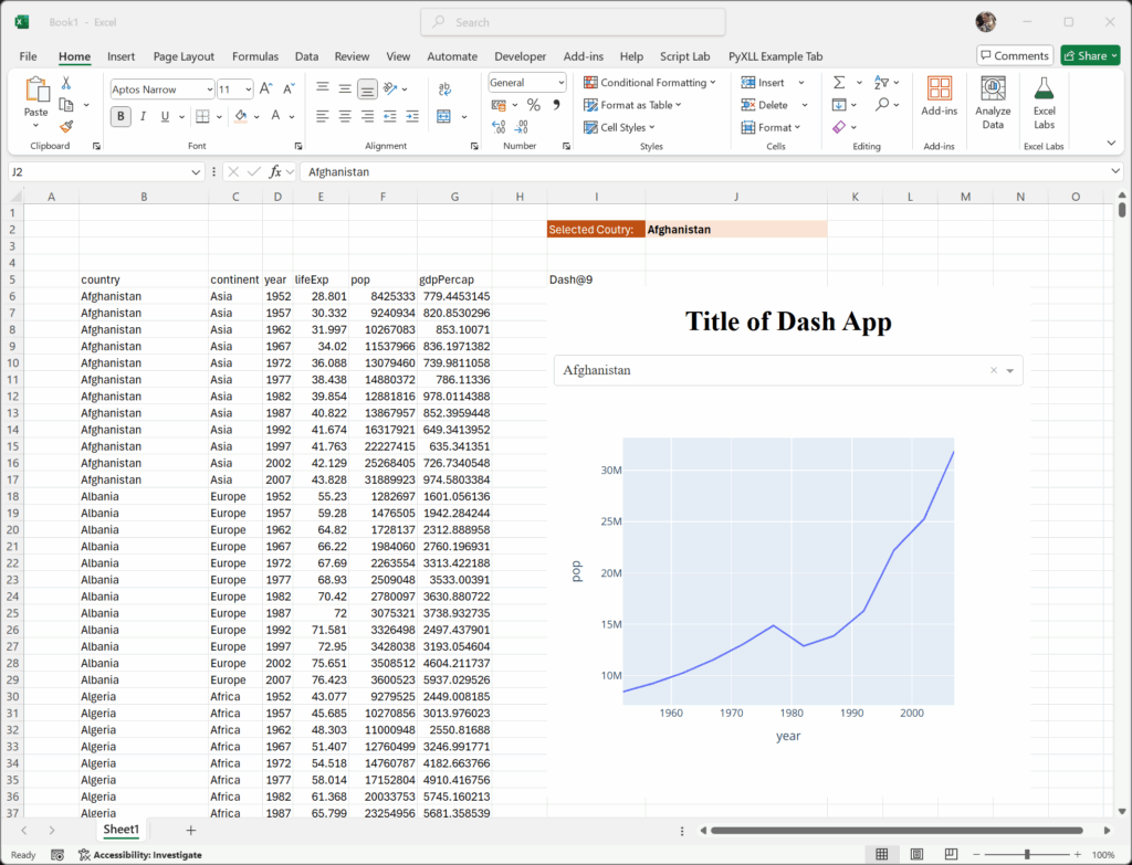
We can make use of Dash’s callbacks to write data to Excel from Dash. In our “dash_app” function we have a callback that gets called when the country selection is changed, but how would we write that country back to Excel so that it can be used elsewhere in the sheet?
PyXLL’s “xl_app” function is used to get the Excel Application object. That Excel Application object is the same as the Application object in VBA and can be used to script Excel in the same way as VBA. We’ll use that to write the selected country to a cell.
Important: When using the Excel Application object we have to be careful. Calling it from outside of an Excel macro function or where Excel is not expecting it to be called (e.g. a background thread) is a common cause of Excel crashes! To avoid that, PyXLL has a function “schedule_call” that will schedule a Python function in a way that makes it safe to call into Excel.
from pyxll import xl_app, xl_func, plot, schedule_call

def update_cell(address, value):
    # Get the Range we're going to update
    xl = xl_app()
    cell = xl.Range(address)

    # Update the cell value
    cell.Value = value


@xl_func
def dash_app(df: pd.DataFrame):
    app = Dash()

    app.layout = [
        html.H1(children='Title of Dash App', style={'textAlign':'center'}),
        dcc.Dropdown(df.country.unique(), 'Canada', id='dropdown-selection'),
        dcc.Graph(id='graph-content')
    ]

    @app.callback(
        Output('graph-content', 'figure'),
        Input('dropdown-selection', 'value')
    )
    def update_graph(value):
        # Update the value of "J2" in Excel
        schedule_call(update_cell, "J2", value)

        dff = df[df.country==value]
        return px.line(dff, x='year', y='pop')

    # Show the dash app in Excel using PyXLL's plot function.
    # This requires the "pyxll-dash" package to be installed.
    plot(app)

    return app
Now when we update the selected country, the value in cell J2 updates:

It’s not ideal to hard-code a cell reference like this into our Python code. Instead, a better solution is to pass a “range” object in to our Python function and then update the value in that range.
We have to be careful though as our function will be re-calculated each time any input to it changes. If we update the range passed to it from our callback, that will trigger the function to be called again. That can lead to an infinite loop where our function updates the cell, which calls the function, which updates the cell and so on – this would result in Excel becoming unresponsive!
To avoid that, rather than simply setting the value, we check to see if the value is already set to the correct value and don’t update it if it is. That will break the cycle and ensure that our function doesn’t constantly recalculate.
from pyxll import xl_app, xl_func, plot, schedule_call

def update_cell(cell, value):
    # Update the cell value, but only if needed to avoid an infinite loop
    if cell.Value != value:
        cell.Value = value


@xl_func("dataframe df, range country_cell: var")
def dash_app(df, country_cell):
    app = Dash()

    initial_value = country_cell.Value

    app.layout = [
        html.H1(children='Title of Dash App', style={'textAlign':'center'}),
        dcc.Dropdown(df.country.unique(), initial_value, id='dropdown-selection'),
        dcc.Graph(id='graph-content')
    ]

    @app.callback(
        Output('graph-content', 'figure'),
        Input('dropdown-selection', 'value')
    )
    def update_graph(value):
        # Update the country cell in Excel
        schedule_call(update_cell, country_cell, value)

        dff = df[df.country==value]
        return px.line(dff, x='year', y='pop')

    # Show the dash app in Excel using PyXLL's plot function.
    # This requires the "pyxll-dash" package to be installed.
    plot(app)

    return app
Now, in Excel, update the function call and pass in the cell to write the selected country to as the second argument:

With this change, every time the country is changed in the dash app it updates in Excel, and every time it changes in Excel the dash app updates!
Next Steps
Combining Plotly Dash with Excel using PyXLL opens up powerful new possibilities: you get the flexibility and interactivity of web-based dashboards, without asking your users to leave the comfort of their spreadsheets.
In this post, you learned how to:
- Build a simple Plotly Dash app using Python,
- Embed that app inside Excel using PyXLL and the
pyxll-dashpackage - Connect the app to live Excel data for dynamic, real-time updates
- Update Excel in response to user interaction with your app
This workflow is ideal for:
- Analysts who want to create rich visualizations without switching tools,
- Data scientists who need to share Python models or results with Excel users,
- Teams who want to modernize dashboards while keeping everything in Excel.
If you’re interested in how the “pyxll-dash” package works, or if you want to embed other types of web apps, you can find the source code for this package on github here https://github.com/pyxll/pyxll-dash.
What to Build Next
Here are a few ideas for extending what you’ve learned:
- Add dropdowns and sliders in Dash to control Excel-based simulations
- Create a financial model front-end with real-time charts and toggles
- Build a dashboard that pulls data from external APIs and displays it in Excel
- Use Dash DataTables to show large datasets and filter them interactively
Try It Yourself
Want to give it a try?
- Try PyXLL for yourself with a free trial
- Check out some of the sample Dash apps from the Dash documentation
- Embed it into Excel and start customizing it for your team’s workflow
With just a bit of Python and PyXLL, you can bring modern, interactive analytics right into the tool your team already knows.
If you found this guide helpful, consider sharing it or subscribing for more tutorials like this. And if you build something cool with PyXLL and Dash, we’d love to see it!