
Pandas provides some convenient plotting capabilities based on the matplotlib package. Using pandas to
plot DataFrames can be more convenient than using matplotlib directly, and because the result is
a matplotlib figure it can be used with PyXLL’s plot function.
Plots created using matplotlib via pandas are displayed in Excel as images and are not interactive controls.
The DataFrame.plot plots using matplotlib.pyplot and plots to the current pyplot figure. This
can then be displayed in Excel using plot. When passed no arguments, plot plots
the current matplotlib.pyplot figure and closes it.
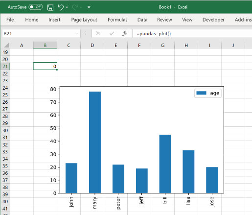
from pyxll import xl_func, plot
import pandas as pd

@xl_func
def pandas_plot():
    # Create a DataFrame to plot
    df = pd.DataFrame({
        'name':['john','mary','peter','jeff','bill','lisa','jose'],
        'age':[23,78,22,19,45,33,20],
        'gender':['M','F','M','M','M','F','M'],
        'state':['california','dc','california','dc','california','texas','texas'],
        'num_children':[2,0,0,3,2,1,4],
        'num_pets':[5,1,0,5,2,2,3]
    })

    # A simple bar chart, plotted using matplotlib.pyplot
    df.plot(kind='bar',x='name',y='age')

    # Show the current matplotlib.pyplot figure using pyxll.plot
    plot()
As with the previous matplotlib examples, when this function is called from Excel the plot is shown below the calling cell.
The Pandas plot function optionally takes a matplotlib.Axes object. This can be used to plot to a
specific Axes object instead of to the current matplotlib.pyplot figure. For example, for doing subplots
or if you need more control over the matplotlib.Figure being used.
from pyxll import xl_func, plot
import matplotlib.pyplot as plt
import pandas as pd

    @xl_func
    def pandas_plot():
        # Create a DataFrame to plot
        df = pd.DataFrame({
            'name':['john','mary','peter','jeff','bill','lisa','jose'],
            'age':[23,78,22,19,45,33,20],
            'gender':['M','F','M','M','M','F','M'],
            'state':['california','dc','california','dc','california','texas','texas'],
            'num_children':[2,0,0,3,2,1,4],
            'num_pets':[5,1,0,5,2,2,3]
        })

        # Create the matplotlib Figure and Axes objects
        fig, ax = plt.subplots()

        # Plot a bar chart to the Axes we just created
        df.plot(kind='bar',x='name',y='age', ax=ax)

        # Show the matplotlib Figure created above
        plot(fig)