
To plot a plotly figure in Excel you first create the figure in exactly the same way you would
in any Python script using plotly, and then use PyXLL’s plot function to show it
in the Excel workbook.
Plotly supports interactive charts and these are displayed in Excel using an interactive web control, where available [1].
The code below shows an Excel worksheet function that generates a plotly figure displayed it in Excel.
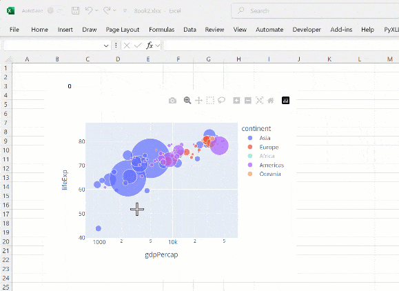
from pyxll import xl_func, plot
import plotly.express as px

@xl_func
def plotly_plot():
    # Get some sample data from plotly.express
    df = px.data.gapminder()

    # Create a scatter plot figure
    fig = px.scatter(df.query("year==2007"),
                     x="gdpPercap", y="lifeExp",
                     size="pop", color="continent",
                     log_x=True, size_max=60)

    # Show the figure in Excel using pyxll.plot
    plot(fig)
When this function is run in Excel the plot is shown just below the calling cell.
If the interactive web control is not available, the figure will instead be exported as a static
image. This is done by PyXLL using plotly’s write_image method. This requires an additional
package kaleido to be installed.
To install kaleido use pip install -U kaleido, or conda install -c plotly python-kaleido
if you are using Anaconda.
PyXLL also supports using the legacy orca package, but from plotly 4.9 onwards it is recommended that you use kaleido.
Whenever you change an input argument to your plotting function, the chart will be redrawn.
You can use this to create interactive dashboards where the Excel user can control the inputs to the plot and see it redraw automatically.
If you have any problems with exporting plots as html or using the interactive web control,
you can tell PyXLL to use a static image format instead by passing allow_html=False
to plot.
When exporting as an image and not html, an SVG image may be used. If you version of Excel does
not support SVG images (Excel 2016 or earlier) or you are having problems with the SVG image
not displaying correctly you can tell PyXLL to use the PNG format instead by passing
allow_svg=False to plot.
If you are not using the interactive web control and the figure is being exported as an image, plotly launches a kaleido or orca subprocess to do the export.
The first time you export an image from plotly it can take a few seconds.
If you have anti-virus software installed it may warn you about this subprocess being launched.
Footnotes